Resource Articles
Changes In Opioid Prescriptions Across the US
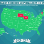 This gif illustrates the changes in opioid prescribing rates in each state, year-by-year, from 2006 to 2016. Over the decade, the rates of neighboring states tend to follow similar trends — this is visible when blocks of red (decreases) or green (decreases) appear on the map. For example, the entire New England region saw a decrease in prescribing rates between 2008 and 2009, whereas most of the rest of the nation saw an increase.
A visualization of this type helps us to understand how geography affects the epidemic, and how this crisis has evolved over time. Interestingly, every state saw a decrease in prescribing rates between 2015 and 2016. However, these rates take population increases into account. This begs the question: How does the Opioid Commission best measure success — a decrease in opioid prescriptions per person on average, or a decrease in opioid prescriptions overall? Read More →